
Subway Series
A collection of charts looking at the history and experience of the New York City Subway.
#1: Even adjusted for inflation, the cost of a swipe keeps going up
In 1913, a subway ride cost a nickle, or $1.60 in inflation-adjusted dollars. Today’s price of $2.90 is 80% more than that. However, the subway system has changed a lot in over 100 years. The several independent rail systems were merged into the unified system we know today, the cars have air conditioning and the stations have elevators and wifi.
#2: It took several years for OMNY to surpass MetroCards as the most used payment method
The history of the subway is also a history of how people paid for the subway. Riders could still pay with tokens until 2003. The MetroCard was introduced in 1993 and is expected to be phased out in 2025 when OMNY, which stands for One Metro New York and lets users tap to pay with a phone or credit card, will be the only available payment method.
Even though everyone has a smart phone, it took over years for OMNY to surpass MetroCard’s dominance as the preferred payment method.
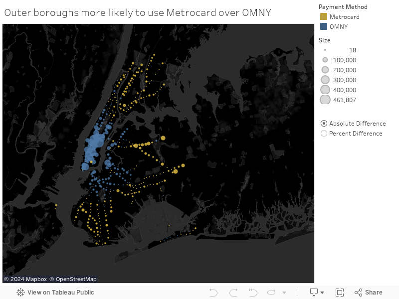
#3: MetroCards are still the preferred payment method in the outer boroughs
The map highlights a clear divide between OMNY and MetroCard usage across the boroughs. OMNY, New York City's latest tap-to-pay system, is predominantly used in Manhattan and Brooklyn, while MetroCard remains the favored payment method in the outer boroughs of Queens, the Bronx, and Staten Island. This geographic distribution provides a visual representation of the technological adoption trends among different neighborhoods.
While this map demonstrates the prevalence of OMNY in Manhattan and Brooklyn, it doesn’t explain why. We can make guesses about what role socioeconomic and demographic factors play but we’ll need more data before making any conclusions.
#4: High earners prefer OMNY
The geographic correlation to OMNY usage is clear but there must be more to the story. For this next chart, I wanted to see if there was also an economic one. I focused on the 10 stations where OMNY is used the most and 10 stations where MetroCard is used the most. The most striking finding? The average median income at the top OMNY stations is almost 3x as much as the top MetroCard stations!
Here are the top 10 OMNY stations and the top 10 MetroCard stations mapped with a marker sized by the census tract’s median income. Anecdotally, we know that the OMNY-dominate stations in Williamsburg and SoHo are home to a lot of high-earners. But does that explain everything? I’d love to take this further by looking at demographics and income for all stations and see if the pattern sticks.
#5 Only 30% of stations are ADA accessible
Every NYC subway station offers riders free Wi-Fi but only 30% are ADA accessible. That means riders using a wheelchair, pushing a stroller or lugging a giant suitcase won’t be able to get to the platform via escalator or elevator.
Not surprisingly, Manhattan’s central business district has the highest density of ADA options but the further out you go, the farther the distance between accessible stations. This is what the subway map looks like to someone who can’t use stairs.
#6 The Subway is reliably delayed
If you were riding the B, D or M lines in June 2024, I hope you left early because those were the most delayed lined that month. In fact, every single line has behind schedule as measured by the average time passengers waited on the platform and on the train beyond the schedule.
There was one on-time all star — The Rockaway S. As one of the shortest lines in the system, it actually averaged earlier than scheduled arrival times.